After two months of hard work by our amazing intern Luna Aguilar, we now present to you our new YSEA logos!
Drumroll, please…
Here they are!

“The design of this logo focuses on the human element of YSEA and highlights the fact that most members are Yale alumni. Since the organization’s name does not highlight this alumni connection, this design puts that idea at the forefront. This is present by the various blues that fill out the people which features the Yale Blue on the right and various shades of blue for the other characters. The reasoning for the different shades of blue is to visually represent the uniqueness of the individuals in YSEA. Although all are Yale-affiliated STEM people, everyone majored in different areas of STEM, are in different stages with their Yale education, pursued unique careers, and have experienced different walks of life and this is highlighted and appreciated in the design. The center person has a graduate cap in order to indicate that they are an alumni. The two people in the back do not have the caps because having the elevated people wearing caps would give off the impression that older and more educated individuals are literally above other individuals. Additionally, not all YSEA members are alumni but rather current Yale students or have another distinction.
The elements surrounding the people represent different areas of STEM. The gear is present in YSEA’s original seal and is a clear representation for engineering. In order to emphasize that the organization is for people who belong to all areas of STEM and not only to engineers, there are symbols that represent the “soft sciences” such as a flower. The flower also serves to bring a more feminine flair to the design to indicate that women are integral to the male-dominated STEM space. This is also why the flower is purple and pink, colors typically associated with femininity. The flower is imperfect in its design, with hand-drawn petals that have different divots. This shows the natural imperfections found in nature as well as the imperfections and mistakes that have defined the STEM world. The DNA is also included to represent the biological sciences and it is placed at the bottom of the overall logo to frame the people and make it seem like they are grounded rather than floating in space.
The “YSEA” text is in white in order to stand out against the blue, and it is a simple font to both maintain the simpleness and even edges of the design and also not take too much attention away from the logo design itself. The other text included in the design is the year the organization was founded written as “EST 1914.” The text is thinner and below the YSEA text since that is typically how companies include the founding year in their logos.
As for overall color choices, some of the other colors represented (lighter blue and light grey) are also colors Yale uses alongside Yale Blue as noted on their website. There are additional colors not associated with Yale to clarify that YSEA is a legally separate organization from Yale. Therefore the logo cannot rely on Yale’s trademarked colors and symbols.
There are different uses for the various logos. This logo is meant for avatar purposes on social media and therefore is based within a gear in order to be circular. The three elements here are a gear, DNA, and a flower. They are the same in style as in the logo with people in order to maintain cohesion between the logos. The gear is the base of the logo since the YSEA began as the Yale Engineering Association (YEA) and visually provides the idea that it is the foundation of the organization which then grew to add more areas of STEM. The gear also serves well as a base to highlight the other elements in the design. The gear is a lighter shade of blue to contrast and compliment the flower as well as to create a link to Yale.

The DNA is in a loop to go along with the circular style and it loops infinitely which represents the assumed lifelong affiliation to Yale and YSEA. The flower serves the same purposes noted in the previous logo. It is at the center because it works the best aesthetically. It also serves as an impactful point to put a historically feminine symbol at the center of a logo for a STEM organization.

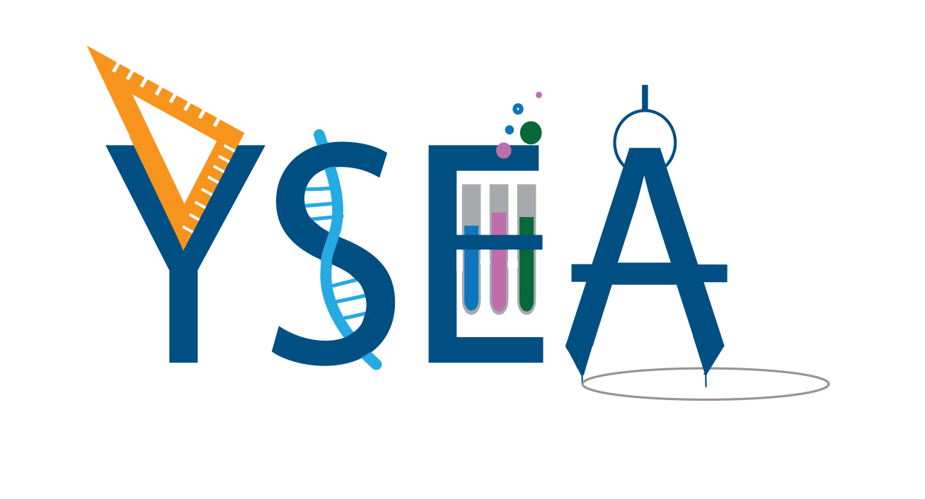
This logo includes elements from different areas of STEM. The lettering for YSEA is in the Yale Blue that makes it easier to create a connection between YSEA and Yale. The objects included were chosen because of how they worked visually with their given letter. There are elements alluding to chemistry, biology, engineering, and architecture. Although not all of STEM is represented, there is an attempt to include both “science” and “engineering” at large in an aesthetically pleasing manner.
All the symbols incorporated with the letters intentionally go beyond the letter. The triangle ruler is not confined within the space in the “Y” but instead goes a lot higher above the letter. The DNA in the “S” sticks out from above and below the “S” curves. The test tubes in the “E” do in fact stay within the vertical space of the letter but the bubbles go outside the “E” region. The test tubes are three different colors (blue, pink, and green) simply to add more color to the design that would otherwise be overwhelmed by blue. The colors also make the design a bit livelier. The “A” serves as a compass and the circle drawn by the compass is included in order to add even more protrusion. This serves as an overall metaphor for STEM being an area where going beyond the boundaries is encouraged in order to make progress. As a result, YSEA also supports going beyond what’s needed to support STEM at Yale.”

Luna Aguilar YC ‘24,
YSEA Summer Intern 2021

Luna Aguilar ‘24 is a rising sophomore and a prospective biomedical engineering major at Yale. Born and raised in Morristown, New Jersey, she has always been fascinated by the world of STEM. She served as the vice president of her school’s engineering club and attended STEM college programs every summer. At Yale, Luna is a co-founder of a mentorship program for underrepresented groups in STEM, connecting Yale undergraduate and graduate students of similar identities. She also serves as the Mentor Director for New Haven REACH where she mentors local high school seniors with their college applications and attending La Casa Cultural events. Currently she is serving as a YSEA summer intern and hopes to keep supporting YSEA in her undergraduate years and beyond!
